Okay, I’ll admit it. That headline is a little click-baity. And after you hear the simple answer, you’ll probably be a little angry with me. But my goal is genuine: to help you avoid marketing failure.
So, let me explain in advance. The answer to the headline is simple, but doing it is hard.
What is the one thing you must do to avoid marketing failures? Be crystal clear in what you can do for your potential customer. That’s simple to say but hard to do. So, unless your business is a household name, you’ll probably get something out of this article.
Why it’s important
When you are trying to get new customers, they may be at a very unfamiliar stage with what you offer. They may know they have a problem, but either aren’t aware of a solution or don’t know if you can help them.
Even worse, they may not even know they have a problem, so you have to make them aware of it. So, there is very little time to make the reader understand what you do.
Confuse them and they will leave for someone else.
That’s why getting the words right is absolutely critical.
Where and when it’s important
Everywhere and all the time. That was easy. Let’s move on.
Just kidding, you know it can’t be that simple. Well, it almost is.
There’s really no need for complicated copy ever, but there are times and places when it is absolutely non-negotiable.
If you are a start-up or not a household brand, then you’ll definitely want to strive for clarity in everything. But it is especially critical in the opening section of your copy.
You have to follow the five-second rule when keeping visitors on your website.
No, I’m not talking about how quickly you can get to that Oreo after it hits the kitchen floor.
I’m talking about the time you have to make visitors understand your offer.
Every second a visitor spends burning calories trying to figure out your offer increases their chance of leaving.
And then they’ll be outta here like – a person leaving. Sorry, couldn’t think of anything.
Anyway, just make sure your offer is absolutely clear and concise.
How to capture attention with clarity
Growing up, one of my favorite business signs was outside a local seafood market. It was colloquial but spot on.
In big, bold letters, it proclaimed, “If it swim, we got it.”
The message was clear: Look no further. We have the seafood you want.
The owners could have put a laundry list of items on their sign, like so many other markets did back then. Maybe customers would pass by slow down enough to read them all.
But the owners knew, even back then, customers probably wouldn’t, so they made the message quick and easy to remember. Just the business name in big letters and the slogan underneath.
That’s the first lesson in establishing clarity.
Keep it short and sweet. Easy to understand and hard to forget.
Other ways to establish clarity
Not every website has to start with a statement. Instead, you can ask a question that addresses customers’ pain points.
For example, if you run an IT security company, you know potential clients have one overriding worry: network security. You may have a bajillion services that address it, and you want to talk about all the ways you can help.
Great.
But all your visitor needs to know in the first five seconds is that they are in the right place.
So just ask the question right away on your website. Make it your tagline.
“Are you worried about the safety of your computer network?”
“Why, yes, I am,” thinks your visitor.
“We can help.”
“Really? Wonderful, I’ll keep reading.”
And that’s it. You have the visitor’s attention. No fluff, no technospeak.
Another alternative is to show them where they could be if they do business with you.
This is my homepage. It’s designed to get the attention of business owners and marketing agency owners.
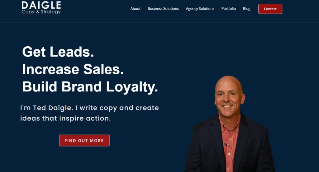
The first three lines address most of their overriding concerns. And it does it in five seconds.
Now, what if it’s not a website? What if it’s an ad?
Some different dynamics are going on there because chances are the person you are speaking to didn’t seek you out as a web visitor does.
To put it bluntly, you invaded their space. The reader may not appreciate it and probably want to move on with their lives as quickly as possible.
Make them work or confuse them even for a few seconds, and, chances are, they will be gone.
The ad below avoids this problem by drawing your eye to the testimonial with the design.

Then it does something significant. It gives a real-life, no-kidding example of something everyone in the target audience would like to achieve.
And the language is crystal-clear. A third-grader could understand it.
It uses a number and the company name quickly and efficiently. If the testimonial would have said, “I got more value from my website,” it probably would be less effective.
Vague language, even if it is clear, won’t work. Copy must address a pain point or show measurable achievement.
Keep attention with clarity
Once you have a customer’s attention, keep being clear. To do that simply:
1. Tell your customer how you will help them.
2. Make sure they understand you.
This is not the time to launch into techno-babble or vague taglines.
“But, Ted, what if my service is very technical?”
No worries, my friend. Use technical terms if your target audience expects it and quickly understands what you mean.
But if you surround those technical terms with fluffy, puffy language? Well, now, you’ve got a problem.
Here’s an example from the website of a company selling a glucose stabilizer. They established what they do at the beginning of the page.
As you scroll down, this appears.

This is directed at an educated audience used to seeing these terms. Every technical term is part of their everyday business dialect.
But all the other language is straightforward. So the intended audience burns very few mental calories trying to understand the message.
A creative masterpiece? Hardly.
Effective at moving a customer through the text and getting them to take action? Yep.
Enemies of clarity
Sometimes you’ll see a very creative, beautifully designed ad that just does not work.
You can be sure all the ad wonks in the plain language camp are wagging their fingers with, I-told-you-so looks on their faces.
The thing is, creativity is not the enemy. Neither is fancy design. All those things are good if they help your customer understand how you are trying to help them.
Check out this ad I ran across in a LinkedIn post.
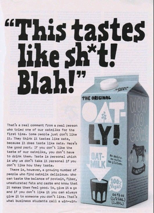
Now, we marketing wonks will sit in our little circles and debate the merits of this ad all day. (And we did)
That’s a whole different blog.
But it’s hard to deny that it uses clear language to get your attention. Then it uses that same voice to keep the attention of its intended audience.
It is creative, uses fancy art, and trendy terms like vegan and gluten-free. But it’s still clear.
There is no doubt what this ad is trying to introduce itself to people who have never tried oat milk but might want an alternative to dairy.
So creativity and clarity aren’t mutually exclusive. You want to reach your customer, but you don’t want to bore them to death.
The real enemy of clarity pops up before the first word is written or the first design is conceived.
It’s a lack of intent and audience empathy.
Every example here knew it just wanted to be clear enough, quickly enough to get the intended audience to keep reading.
My website wants to reach ad agency owners and business owners that know they have a problem doing the three things I mentioned. They are probably already concerned and don’t want to play around. And they wanted to know what to do next, so I put in a strong call to action.
The Oatly ad didn’t want people to immediately buy anything. Instead, it tried to position itself with a younger audience as a dairy alternative.
That audience may not even be thinking about that problem, but the engaging headline forced their eye. Now, that audience will remember Oatley on their next trip to the grocery.
But they remembered to keep the message clear, and it paid off.
How do I know? I did a clarity test on it.
Do a clarity test
This test is simple, easy, and inexpensive.
Just ask someone to read the copy for five seconds. Then, take it away and ask them if they know what it was about.
When I tested the Oatley ad, everyone knew exactly what it was about.
Not everyone liked it, but so what?
Don’t worry about if they love it or hate it, yet.
Just make sure it’s clear first.
Clearly, this blog post is over
Yep, that’s all I have to say about clarity in copy. If you are a business owner, there is nothing more important in your marketing than being clear.
And now you’ve got some knowledge about what customers want and how you can recognize it when someone turns in copy for your review.
So, use these examples and the clarity test to determine if your copywriter is doing their job.
Clear as a bell, right?
